Examples (19)


A Time Triggered Action!

This example shows how to take an action based on a time or schedule. It uses the excellent WP Control plugin.

This plugin allows you to easily set the time window or repeating schedule that you want to use. Here is my logic that I would like to implement. I’ve highlighted my criteria in green and my action in red

If it is 6pm I want to start watering my plants for 3 minutes.

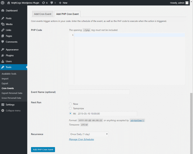
Firstly, I set up a new cron schedule using WP Control. This looks like the picture below. Choose a daily schedule and don’t forget when you first want it to run! I can now start writing my logic in the box.

WP Control – Cron Event

In order to turn on my pump I send a mysensors_in/10/6/1/0/2 the playload contains the number of minutes that the pump should be on.

So lets have a first go at implementing our logic. It is possible to send data to your Mqtt broker really easily using the MqttCogs_Plugin class. This is REALLY easy. The sendMqtt function will even automatically buffer messages for MySensors nodes that implement smartSleep.

I’ve expanded the call parameters into variables but this is not necessary.

$clientid = 'cron_w'; //can be any short text
$outtopic = 'mysensors_in/10/6/1/0/2'; //topic to write to
$outpayload = 3; //payload, on for 3 minutes
$qos = 1; //qos
$retain = 0; //retain
$error = new stdClass();

$mqttcogs = new MqttCogs_Plugin();
$mqttcogs->sendMqtt($clientid, $outtopic, $outpayload, $qos, $retain, $error);

Here’s a second go. This one picks up the return from the function and then emails the result. I haven’t expanded the variables this time to keep things concise.

$mqttcogs = new MqttCogs_Plugin();
$error = new stdClass();

//note that this function returns
// true (message ok or buffered) or 
// false for error
// I just use the $error object though...
$mqttcogs->sendMqtt('cron_w', 'mysensors_in/10/6/1/0/2', 3, 1,0, $error); 
	switch($error->status) {
		case 'ok':
			wp_mail( 'test@test.com', 'Watering on', 'Message sent' ); 
		break;
		case 'buffered':
			wp_mail( 'test@test.com', 'Watering on', 'Message buffered' ); 
		break;
		case 'error':
			wp_mail( 'test@test.com', 'Watering FAIL', $error->errors[0].reason); 	
		break;
	}


Visualize OwnTracks GPS Data

This post describes how to visualize Mqtt data from the OwnTracks App.

For this experiment I installed OwnTracks onto my phone and filled in my credentials for my Mqtt broker.

Problem 1: My Mqtt broker uses port 14027. Outgoing data to this port wasn’t allowed on the particular Wifi network I was using. This took me ages to work out and was solved simply by turning off Wifi and using the phone data connection.

When this happens OwnTracks won’t fall back and use a different data connection so you might get delayed tracking data when a user phone moves in and out of particular Wifi networks.

OwnTracks topic and mqtt message format

The OwnTracks format is well documented, see here. It is a little verbose but it does contain longitude, latitude and speed. Be aware that the data can change depending on your phone platform. By default the topic is in the format owntracks/user/device. Both user and device can be set in the App. I actually changed this to owntracks/device.

Here’s an example of the two types of packets that I received from my Android device :

{	"_type":"location",
	"acc":8,
	"alt":56,
	"batt":75,
	"conn":"m",
	"lat":53.8165549,
	"lon":-1.6013796,
	"tid":"1",
	"tst":1557255979,
	"vac":8,
	"vel":0
}

{     "_type":"lwt",
     "tst":1557286504
}

The lwt type is a special ‘last will and testament’ type. It is sent when the device disconnects from the Mqtt broker. This can happen often, particularly if you are travelling!

Problem 2: I need to combine the deviceid from the topic and the lng/lats and timestamp from the payload to get a meaningful piece of data to plot.

Problem 3: What do I do with the lwt (last will and testament) message? This tells me when the device disconnected, although I can’t find a corresponding ‘device has connected’ message.

I can change or shape the data by using a mqttcogs_msg_in_pre filter hook. This is called just before the data is persisted to the wordpress database. I’m going to do aim to do the following:

  • Ignore messages that aren’t of type ‘location’
  • Use the GPS datetime rather than the server time in the utc field
  • Add a new field ‘Desc’ that I actually never use. This is simply to demonstrate how the payload could be manipulated.

add_filter('mqttcogs_msg_in_pre', 'mqttcogs_msg_in_pre', 10, 3);
 function mqttcogs_msg_in_pre($publish_object, $datetime)
 {
     $topic = $publish_object->getTopic();
     //filter by topic
     if (!(substr( $topic, 0, 9 ) === "owntracks")) {
         return $publish_object;
     }
     
     $mqttmsg = $publish_object->getMessage();
     $payload = json_decode($mqttmsg);

     //only do this to correct type of messages
     if ($payload->_type != 'location') {
        return NULL;
     }
     
     //update utc time to GPS datetime
     if (property_exists($payload, 'tst')) {
        $datetime->setTimestamp((int) $payload->tst);
     }
     
     //Now manipulate the payload. This extra attribute isn't actually 
     //used!
     $speed = $payload->vel;
     $nicedatetime = $datetime->format('Y-m-d H:i:s');
     $payload->Desc  = 'Speed:'.$speed.'kph At:'.$nicedatetime;
     $publish_object->setMessage(json_encode($payload));
     return $publish_object;
 }

….and here is the result. I’ve included the shortcode below. Remember that as of version 2.2 the longitude and latitude will be automatically extracted for the Map Visualization. Map looks good but the Google Map Visualization isn’t set up to refresh very nicely. When you set the refresh_secs=”60″ and the data is refreshed, this particular visualization draws the Map tiles and resets the zoom level. Not very useful!

[ mqttcogs_drawgoogle 
	refresh_secs="120" 
	charttype="Map" 
	options="{height:300,zoomLevel:12,showTooltip: true,showInfoWindow:true,showLine:true}"]
	[ mqttcogs_data 
		limit="1"
		order="DESC"
		topics="owntracks/ckandroid"]
[ /mqttcogs_drawgoogle]


Playing with GPS Data using Filter Hooks

I wrote a really basic example here that showed how to plot some GPS points onto map. The example works well but you may have noticed that it relies on the data in the Mqtt message payload formatted in a particular way. Remember what it looked like?

If you’ve worked with GPS devices before you know that the GPS data that ends up at the Mqtt broker won’t look like that. That’s far too simple!

MqttCogs provides a Filter Hook to allow you change the incoming payload before it is persisted to the database. This allows you to reshape the JSON in the payload to a form that can be used by the MqttCogs shortcodes.

To use the hook you need to be able to write some php. I used My Custom Functions wordpress plugin. This allows you to quickly add some php to your site without messing around with functions.php or any other part of your site. I highly recommend this plugin.

My code looks something like this. It reads the payload, changes the format of the incoming payload data. The data is then persisted as normal.

add_filter('mqttcogs_msg_in_pre', 'mqttcogs_msg_in_pre', 10, 3);
 function mqttcogs_msg_in_pre($publish_object, $utc)
 {
     //do nothing if we are not interested in the topic
     if ($publish_object.getTopic() != 'sometopicthatcontainslnglat") {
           return;
     }
     
     //reshape the JSON data
     $payload = $publish_object.getMessage();
     $payload = reshapethedatafunction($payload);
     $publish_object.setMessage($payload);
 }

To extract and plot the values from my json payload I need to instruct MqttCogs where to get them from. Have a read of visualizing mqtt json payload this provides a worked example of how to show your lng lats on a map.

Check out Visualizing OwnTracks GPS Data this uses this principle to show owntracks GPS data on a map!


Making a Gauge Chart

This post explains how to create a Google Visualization Gauge chart.

Extracting Data for a Google Visualization Gauge

Google Visualization Gauges need a bit of thought. If you look at the documentation for the Gauge chart here, there is a sneaky little comment that reads:

At the moment there’s no way to specify the title of a gauge chart as you can with other Google Charts

That makes things difficult. We’ll do our best to create a gauge but it won’t have a title. I’ve instead used a plugin to create 2 columns in my WordPress page and added a title above the Gauge. It’s the best I can do!

Here’s the shortcode for one of the Gauges. I simply get the top 1 row for my one of my probes.

[ mqttcogs_drawgoogle options="{height:200}"
	charttype="Gauge" 
	ajax="true" ]
		[ mqttcogs_data limit="1" topics="mysensors_out/92/1/1/0/0" ]
[ /mqttcogs_drawgoogle ]

Soil Temperature

Air Temperature


Visualizing Mqtt JSON Payload 1

This post describes how to visualize Mqtt data when the Mqtt payload is JSON. I updated this post on 26th May 2019 for version 2.2. The example in this post will not work for versions prior to 2.2!

How is MqttCogs data stored?

Recall that data arriving from the Mqtt broker is persisted to a WordPress table. The data from my MySensors projects looks something like this. You can see that my data is pretty simple – numeric temperature and moisture levels.

By default, when I visualize this data I see a graph that plots utc against payload. Here is the graph that plucks out temperature data for probe 100. I’ve removed all the axes formatting to make the shortcode more readable. (Underneath the surface Mqttcogs returns a datetime and a number/string for each row of data for the Google Visualization)

[ mqttcogs_drawgoogle options="{height:300}" ajax="true" ] 
	[ mqttcogs_data limit="10" order="DESC" topics="mysensors_out/100/1/1/0/0"] 
[ /mqttcogs_drawgoogle ]

So now lets examine some data that has arrived from the Mqtt broker with a JSON payload. I’ve manually added a couple of rows. As you can see they contain latitude and longitude – can you see where this is going?

To extract and plot the values from my json payload I need to instruct MqttCogs how these should be extracted from the JSON data. Prior to version 2.2 this was done server-side. This wasn’t very flexible and only worked with very simple ‘flat’ JSON.

Version 2.2 provides the ability to manipulate the JSON in the client browser using a script. In this simple example we don’t even need to do this!

The default JSON script that is bundled with version 2.2 looks for a longitude and latitude in the JSON data (it’ll scan for lon, longitude, lng and lat, latitude) and uses that to plot the data. It also constructs a simple flag using the the topic name and datetime.

[ mqttcogs_drawgoogle charttype="Map"  options="{
height:300,zoomLevel:12,charttype="Map" ]
   [ mqttcogs_data limit="99999" topics="jsontest/a"  ]

[ /mqttcogs_drawleaflet ]

This great! I can now plot lat, lng on a leaflet map. I could even get the map to update if something was moving!

  • Don’t forget you’ll need to set a Google Maps API key in the plugin settings

The above is a really simple example introducing JSON payloads. Take a look at Part 2. This shows how we can use the ‘script’ attribute to properly manipulate the JSON data before we use it in our visualization.


Just get me the last value!

Updated for version 2.3 – mqttcogs_get shortcode is deprecated and replaced with the mqttcogs_drawhtml shortcode

There are instances where a graph might not be appropriate. I might simply want to display the current temperature outside. I don’t want any fancy formatting I simply want to embed the value in one of my posts. Which value though? The temperature is only meaningful if you know the date and time at which the reading was taken.

It is possible to display both using the [ mqttcogs_drawhtml ] shortcode. In it’s most basic form it will return the most recent datetime or payload field. Here’s the code to display the text above:

[ mqttcogs_drawhtml topics='mysensors_out/100/2/1/0/0'] Last known temperature reading is {0,1}C  taken at {0,0}[/mqttcogs_drawhtml]

So my {0,1} corresponds to row 0, column 1 (19.6) and {0,0} to row 0, column 0

How about MIN/MAX for today?

Technically this should work but for some reason it currently isn’t. I’m looking into now. I tried the following but the date isn’t formatted correctly. Watch this space…

[ mqttcogs_drawhtml topics='mysensors_out/100/2/1/0/0,mysensors_out/100/2/1/0/0' group='DAY' aggregations='MIN,MAX' ] Min Temperature was {0,1}C  taken at {0,0}
 Max Temperature was {1,2}C  taken at {1,0}[/mqttcogs_drawhtml]

What about other days?

It’s also possible to specify a ‘from’ and ‘to’ attribute and a sort attribute. This would allow you to get the start and end temperature for a given date range. I’m not sure why you might want to do this!


Multiple Series

The Really Simple example showed how to create simple LineChart and show one series. It’s possible to show multiple series on the same graph. In this example I’m going to show the air temperature and soil temperature for my basil plant that sits on my kitchen window sill. This example shows how to use the topics attribute.

Lets recap. We’ve got a graph on the screen using the following code:

[ mqttcogs_drawgoogle ]
       [ mqttcogs_data topics="mysensors_out/100/1/1/0/0" ]
[ /mqttcogs_drawgoogle ]

Adding another series to the same graph is pretty easy. The topics attribute accepts a comma delimited list of topics. So I can simply change my shortcode to include the second temperature sensor that I have on this probe:

[ mqttcogs_drawgoogle ]
       [ mqttcogs_data topics="mysensors_out/100/1/1/0/0,mysensors_out/100/2/1/0/0" ]
[ /mqttcogs_drawgoogle ]

The output looks like this:

Obviously, we can tidy things up a bit by setting the options attribute as well as described in Labelling Axes. Our shortcode then becomes:

[ mqttcogs_drawgoogle 
	options="{
			series:{0:{labelInLegend: 'Soil'},1:{labelInLegend: 'Air'}},
			curveType:'function',
			title:'(100) My Kitchen Basil Temperature',
			height:300,
			hAxis: {title: 'DateTime(UTC)',format:'dd MMM HH:mm' },
			vAxis: { title: 'Temp (C)' }}" ]
    [ mqttcogs_data limit="100" topics="mysensors_out/100/1/1/0/0,mysensors_out/100/2/1/0/0" ]
[/mqttcogs_drawgoogle ]

The pretty excellent result looks like this:


Labelling Axes

The Really Simple example showed how to create simple LineChart using a tiny amount of code. The graph showed some data but was missing horizontal and vertical axes. It was also missing a title. This example shows how to use the options attribute to make your graph look a bit more presentable.

Lets recap. We’ve got a graph on the screen using the following code:

[ mqttcogs_drawgoogle ]
       [ mqttcogs_data topics="mysensors_out/100/1/1/0/0" ]
[ /mqttcogs_drawgoogle ]

We are going to extend this and add a legend and axis labels to our graph. Here is the example updated to include some labelling

[ mqttcogs_drawgoogle options="{  series: {0:{labelInLegend: 'Soil'}},  curveType:'function',  title:'(100) My Kitchen Basil Temperature',  height:300,  hAxis: { title: 'DateTime(UTC)',format:'dd MMM HH:mm' },  vAxis: { title: 'Temp (C)' }}" ]
              [ mqttcogs_data limit="100" topics="mysensors_out/100/1/1/0/0" ] 
[/mqttcogs_drawgoogle ]

There aren’t any secrets here, the options attribute is a javascript object literal that is passed into the Google Visualization graph constructor. Here is a link to show the options attribute explained for the Google LineChart. The result is:

Notes:

  • I haven’t specified a width as the chart will automatically grow to fit the container.
  • I’ve changed the curveType to ‘function’ to smooth out the graph


Really Simple

This example shows how to create simple LineChart using the smallest amount of code. Lets start by taking a look at the shortcode. As with all the examples, I’ve added a space after/before any square brackets to make sure that the shortcode is not processed. You need to remove this if you are copying this code!

[ mqttcogs_drawgoogle charttype="LineChart" options="{}" ] 
      [ mqttcogs_data topics="mysensors_out/100/1/1/0/0" ]
[ /mqttcogs_drawgoogle ]

There are two shortcodes you need to use. The outer shortcode mqttcogs_drawgoogle  to tell the plugin that you want to draw a graph and the inner shortcode mqtt_data to tell the plugin what data you want to use.

As you can see from the example, the only required at attribute you need to draw a graph is the topic you want to use as your series. Any attribute that is not specified is set to it’s default value.

The topic that I want to graph is mysensors_out/100/1/1/0/0. This is the standard MySensors format for sensor id 100’s temperature. You don’t have to use MySensors you can graph any MQTT data stream!

The output of this looks like this: