This post describes how to manipulate the Mqtt payload when it contains JSON data. You must be using Version 2.2 or greater for this example to work!
For this example, we’ll use some owntracks data. See Visualizing Owntracks Data for an introduction. Firstly, lets remind ourselves of what the data looks like in our database.

and here is the expanded JSON data.
{	"_type":"location",
	"acc":8,
	"alt":56,
	"batt":75,
	"conn":"m",
	"lat":53.8165549,
	"lon":-1.6013796,
	"tid":"1",
	"tst":1557255979,
	"vac":8,
	"vel":0
}
My requirements are simple. I want to write a script that will plot my location data on a Google Visualization Map and include a flag that shows the Latitude, Longitude and fix time.
If we examine the documentation for the Map visualization we can see that we need to create data containing fields lat, lng and description. The google map visualization then takes care of the rest.
We are going to use the mqttcogs ‘script’ attribute. This attribute allows a user to apply a javascript function to the data client side. This allows a developer to make full use of the Google Visualization datatable and dataview javascript classes. You can manipulate, filter, group, create calculated columns and format the data before the chart is drawn!
Before we look at a function remember that the script attribute points to a wordpress custom field. The custom field contains the script. This is necessary as we can’t embed a javascript function directly into the shortcode.
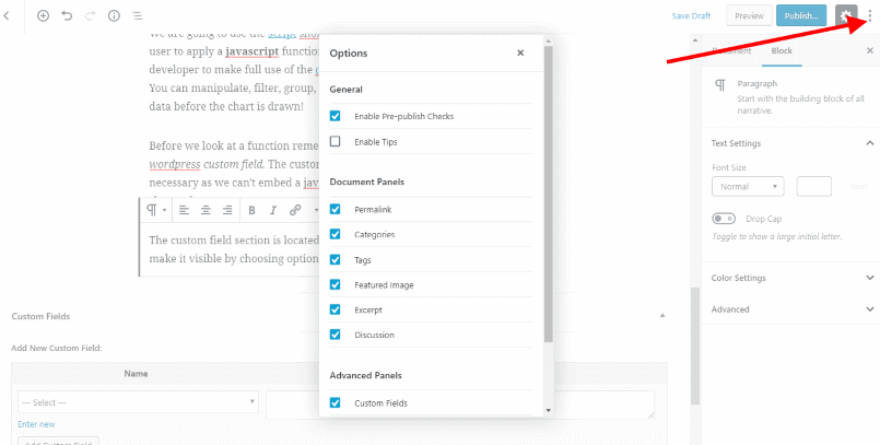
The custom field section is located at the bottom of a post. You will need to make it visible via the Gutenberg editor options.

Now we are ready to examine a typical script. In fact, we’ll look at the default script that is applied if you don’t provide one yourself. Remember this is a javascript function. The parameters include
- data – a google visualization datatable containing the mqtt data
- chart – a google visualization chart, created using the charttype attribute you supplied
- options – a javascript object created from the options attribute you supplied in the shortcode
function (data, chart, options) {
	if (this.charttype == 'Map') {
		var view  = new google.visualization.DataView(data);

		view.setColumns([
			{
				calc:function (data, ridx) {
					var payload = data.getValue(ridx, 1);
					return payload.lat?payload.lat:payload.latitude;
				},
				type:'number',
				label:'Lat'
			},
			{
				calc:function (data, ridx) {
					var payload = data.getValue(ridx, 1);
					return payload.lon?payload.lon:(payload.lng?payload.lng:payload.longitude);
				},
				type:'number',
				label:'Long'
			},
			{
				calc:function (data, ridx) {
					return data.getColumnId(1) + ' @ ' + data.getValue(ridx,0);
				},
				type:'string',
				label:'Description'
			}
		]);

		chart.draw(view, options);
	}
	else {
		chart.draw(data, options);
	}
}
The above code is very simple. We check if the chart is a Map, if it isn’t we simply draw the chart using the datatable.
If the chart is a Map, then we create a DataView with three columns. Columns 1 and 2 are latitude and longitude (we do our best to find them as they could be named differently depending on the data source) and Column 3 is a string composed of the topic and the utc (datetime). The visualization is then drawn using the view rather than the datatable.
So here is our updated function.
function (data, chart, options) {
	if (this.charttype == 'Map') {
		var view  = new google.visualization.DataView(data);

		view.setColumns([
			{
				calc:function (data, ridx) {
					var payload = data.getValue(ridx, 1);
					return payload.lat?payload.lat:payload.latitude;
				},
				type:'number',
				label:'Lat'
			},
			{
				calc:function (data, ridx) {
					var payload = data.getValue(ridx, 1);
					return payload.lon?payload.lon:(payload.lng?payload.lng:payload.longitude);
				},
				type:'number',
				label:'Long'
			},
			{
				calc:function (data, ridx) {
					var payload = data.getValue(ridx, 1);
					return 'Lat: ' + payload.lat + ' Lng: ' + payload.lon + ' @ ' + data.getValue(ridx,0);
				},
				type:'string',
				label:'Description'
			}
		]);

		chart.draw(view, options);
	}
	else {
		chart.draw(data, options);
	}
}
The ‘this’ object contains, amongst other things the shortcode attributes. We use this to determine the type of chart that we are drawing.