Version 2.3 comes with some very simple css classes. In this post we are going to use a single css class group-card.
Using this class you can now very easily create a ‘card’ layout that flows using the Gutenburg editor. The mqtt-card css must be applied to a Gutenberg container, as you can’t apply custom css to a shortcode block. In this example we’ll use a Gutenberg group block.
Step 1: Create a Group Block
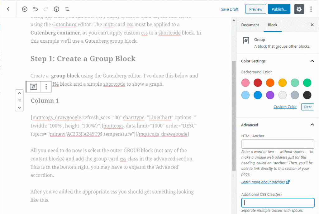
Create a group block using the Gutenberg editor. I’ve done this below and added an H4 block and a simple shortcode to show a graph.
Column 1
All you need to do now is select the outer GROUP block (not any of the content blocks) and add the group-card css class in the advanced section. This is in the bottom right, you may have to expand the ‘Advanced’ accordion.

After you’ve added the appropriate css you should get something looking like this. If you want you can change the background colour. It is set to an off white colour so that you can see that you’ve applied the card css correctly.
Column 1
The above card is ‘ok’ but stretches across the whole page. Not fantastic. If you want a number of cards on one page then use a columns block and move your group into the columns block. I’ve done this here. I’ve used a 3 column layout and changed my graph type to Sparkline.
Today
[ mqttcogs_drawgoogle refresh_secs=”30″ charttype=”SparklineChart” options=”{width: ‘100%’, height: ‘100%’, vAxis:{gridlines: { count:0},minorGridlines:{count:0}}}”][ mqttcogs_data from=”-1″ order=”DESC” topics=”minew/AC233FA249C9$.temperature”][/mqttcogs_drawgoogle]
Yesterday
[ mqttcogs_drawgoogle refresh_secs=”30″ charttype=”SparklineChart” options=”{width: ‘100%’, height: ‘100%’, vAxis:{gridlines: { count:0},minorGridlines:{count:0}}}”][ mqttcogs_data from=”-2″ to=”-1″ order=”DESC” topics=”minew/AC233FA249C9$.temperature”][/mqttcogs_drawgoogle]
2 days ago
[ mqttcogs_drawgoogle refresh_secs=”30″ charttype=”SparklineChart” options=”{width: ‘100%’, height: ‘100%’, vAxis:{gridlines: { count:0},minorGridlines:{count:0}}}”][ mqttcogs_data from=”-3″ to=”-2″ order=”DESC” topics=”minew/AC233FA249C9$.temperature”][/mqttcogs_drawgoogle]
I’ve added my shortcode to each of the cards. The benefit of the column layout is that the cards will now ‘flow’ as you change the size of the page. The css is really simple. It looks like this so you can change it if required.
.group-card {
  padding-top: 0px;
  padding-right: 5px;
  background-color: #f2f2f2;
  padding-left: 5px;
  border-radius: 2px;
  box-shadow: 0 2px 2px 0 rgba(0,0,0,0.14), 0 1px 5px 0 rgba(0,0,0,0.12), 0 3px 1px -2px rgba(0,0,0,0.2);
  transition:0.3s;
}

.group-card h3 {
	padding-top:10px;
	font-weight:400!important;
}
.group-card h4 {
	padding-top:10px;
	font-weight:400!important;
}
No Comments
You can leave the first : )